Showing posts with label design. Show all posts

Thursday, July 16, 2026

BIRD’S-EYE PEE-EW – The Sad Decline of Balconies

As a designer and former architecture student, I despise the plague of cheap, soulless apartment and condo buildings popping up around town in recent years. Especially here in the neighborhoods surrounding the University of Minnesota’s sprawling Minneapolis campus.

Most are dull, three- to twenty-story cuboids clad in various colors of stamped metal siding. (As if color could mask the lack of imagination.) With little dimen-
sion, detailing or texture, they appear to have been built on the cheap for a shelf 
life of about ten years.

HANGING BY A THREAD
As if to double down on the shallow design, the builders—pretty sure they’re not architects—nearly always tack on a bristling of tiny, barely-closet-size balconies. Underscoring the tackiness, they opt not to even try integrating them into the building’s structure. 

Instead, they’re more or less screwed into the façade, where it seems the only thing keeping them from simply falling off under their own weight is a pair of half-inch cables. I'm sure the wires are up to the job, but they don’t look like it.


These dime-a-dozen, afterthought balconies are more insult than asset! I wonder if prospective renters or buyers actually see these little appurtenances as an attraction—one that probably added a couple hundred bucks to their payments. 

             These “McBalconies” always look 
             more like swings than solid ledges.


CANTILEVER…OR CAN THEY?
More damning than my esthetic gripe is the fact that very few residents even use these bitty balconies. If I scan twenty of them—say on one of these fine summer evenings—I’d be surprised to spot one of them occupied. Few have as much as a folding chair on them.

No wonder. The thin, woven strands holding up all these “McBalconies” make them look more like swings than solid ledges.

NOW THAT’S A BALCONY 
A thoughtful, well-designed balcony, one you’d actually want to use, is a wonder, especially for those without the space, or with too much altitude, for a deck. It affords one a chance to step outdoors now and then, breathe some fresh air, maybe catch some rays. What’s more, you get a bird’s-eye view.

A balcony should at least provide enough room for a couple of chairs and a small table. Room not simply to sit, but to stretch your legs out without them poking through the railing. Even better, space for a few potted plants, perhaps a bird feeder, and—codes permitting—a small grill.


Besides the issue of space, there’s also an esthetic baseline here; a deck has to look solid, as if it’s actually incorporated into the structure of the building, not just glued on. It’s that visual integrity, that intentionality, that makes a decent balcony feel solid and safe.
   It’s a bonus when your balcony’s made of wood.


Though rare these days, it’s a pleasant bonus when your balcony’s made of wood. I know it can be a maintenance issue, but it’s a warmer vibe—kind of like the feel of sitting in a wood canoe instead of one stamped out of cold, hard aluminum or some synthetic supermaterial.


          Nature blesses us with a vital spiritual 
          connection to Mother Earth.

 
ENTREE TO THE REALM

We human animals have a primeval need for secure, elevated vantage points. That need, once driven by the sheer will to survive, eventually gave way—once we gained the luxury of leisure—to simply a desire to enjoy a few of Nature’s won-
ders, even when living in the city.

We all, especially children, need regular doses of what author and Children and Nature Network co-founder, Richard Louv calls Vitamin N (Nature). It calms us, cures us, and blesses many of us with a vital spiritual connection to Mother Earth. A good balcony offers us at least a maintenance dose.

But we’ve been steadily losing touch with Nature since the Industrial Revolution. And never at the staggering rate that’s come with the Digital Age. The Internet, social media and artificial intelligence have all taken ravenous bites out of that essential connection. Bad balconies don’t help.

While I feel sorry for a kid who doesn’t have a back yard to play on, or an adult who’s too busy to spend much time outdoors, thank God there are still ways to experience Nature in an urban setting. A walk, a bike ride, container gardening…all offer us entrée to that precious realm. 

So does a good, solid balcony.

PHOTO: iStock

Tuesday, August 20, 2024

HUES ON FIRST – Rallying Against Chromophobia

When I was a first grader I adored crayons. Those elegant little, translucent cylinders of pure color. I’ll bet you did too.

At school I had to scrounge stumps of them in various lengths from a cardboard box. Soon, though, I got my very own set of Crayolas. I was happy to have them, but it was only an eight-pack, just the basics. So I kept going back to that ratty remnant box because that’s where I could find the subtler, more complex colors.

Then my mom—once a commercial artist, by the way—bought me the big 48-color box, the one with neatly stepped tiers of crayons, some in shades falling in between the basic, primary colors: blue-green, gold ochre, red violet…oh, and the metallics. These, I thought, were colors worthy of keeping within the lines.

I was tickled pink. Even then, as a six-year-old, I knew the power of color to tap into one’s creativity and express one’s temperament.
 
        Purple might be risky and brown was
        to be avoided at all costs.


GOING PRO
Much later, as a graphics designer—thanks, I’m sure, to the encouragement of that first-grade teacher, Miss Whittier—I applied my way with color to the design solutions I crafted for clients, from mom-and-pop furniture stores, to dentists, to universities and symphony orchestras.

Part of my stock in trade was just knowing which colors from my trusty PMS swatch book* would and wouldn’t work for each project. Knowing that you don’t use pink for a bank, olive drab for a restaurant or blood red for a hospital.

I don’t know that anyone actually taught me those rules; it just seemed intuitive. You know, that for a more staid client, purple might be risky and that, for most any client, brown was to be avoided at all costs.

RULES FOR THE BREAKING
As instinctive as that color sense was for me, there’s also lots of research to back it up. It confirms that yellows suggest brightness, cheer and hope. Reds can evoke energy, urgency, anger and danger. Blues portray calmness and trust; greens, freshness and serenity.

While they know these “rules” very well, designers in nearly every field occasionally find value in breaking them for shock value or when they want to push the boundaries of “taste.”

PHOTO: Beautiful Stitches

For example, an edgy tech client (like Yahoo) or one that wants to connote luxury (like Crown Royal whisky), might find a shade of purple quite effective. (That latter interpretation may derive from purple dye’s having been so rare and expensive in ancient cultures that it was affordable only to royalty.)

               UPS has exploited one of the
               least desirable colors: brown.


BRANDING
It’s fascinating, isn’t it, how the color landscape has been mined to identify various companies and causes, each of them appropriating a hue they hope will distinguish them in the marketplace.

IBM grabbed blue a long time ago—in 1947. Later, Verizon claimed red; Heineken, Starbucks and Holiday Inn all took green; while Home Depot and Dunkin’ Donuts have seized on orange.

In what I’ve always felt was one of those gutsy, outside-the-lines moves, UPS has successfully exploited what’s considered one of the least desirable colors for any entity’s branding: brown. All the better, I guess, to ensure no one steals it.

(The only client I remember identifying with brown was the Cornucopia Society, the elite giving club that helps fund the Wells Fargo Family Farm at the Minnesota Zoo. The cover of my brochure for them featured a wavy brown background suggesting a furrowed field.)

SOCIAL CAUSES
In 1979, a Jaycees ladies service organization in Leitchfield, Kentucky organized what became a hugely popular campaign to "Tie A Yellow Ribbon" around trees in yards and public spaces to show support for the U.S. hostages being held in Iran.

Since then scores of other organizations have adopted colors for their causes, among them: red for heart disease and AIDS; orange for leukemia; violet for Hodgkins lymphoma; teal for sexual assault; pink for breast cancer; and green for almost anything related to the environment.


STOP AND GO
And just think of all the other aspects of our culture we’ve come to associate with colors. Often they’re so ubiquitous that we no longer even notice. The iconic red, yellow and green of traffic lights; warning signs; status lights on machines; wire and piping identification; filing tabs… I could go on.

Some brilliant planner realized that even the most confusing mazes of floors and hallways of buildings or building complexes can be color coded to simplify navigation. Someone else must have decided that blue and pink should identify the gender of babies.

And now, more than ever, color has come to define our politics. God forbid any respectable MAGA republican get caught wearing a blue cap; no democrat, a red one! And for the dwindling number of “independent” voters, maybe there should be a color for that too, perhaps a nice red-blue shade of violet.

      Fear and disappointment
      have sucked the color out of our spirits.


ZEITGEIST
Have you noticed what’s happened over the past few decades to the colors of some of American culture’s key expressions of personal identity: clothing, housing and cars? It’s as if the flame of color has just gone out.

First of all, what’s this dark attachment we have with black? Apparently folks need to display various shades of “attitude”—you know, “Hey, I’m outrageous, don’t fv<& with me!”—as if that’s a good thing. Show me 100 heavy metal band tour t-shirts and I’ll show you 95 black ones. For goth shirts, I’ll show you 100—these poor folks are even afraid of the color of their own skin.

This love affair with black is complicated, though; the color does suggest sadness and depression, but in fashion it can also come across as pure elegance, the perfect backdrop for colorful accessories.

Here in Minnesota, where we starve for Nature’s show of color during our long, cold, monochrome winters, you’d think we’d want to pump up our parkas with shades of optimism and joy. Alas, most winter days we’re a sea of sad, drab fiberfilled nylon puffballs.

And our homes; they run the gamut from white to gray to—if you're really adventurous—perhaps a nice, muted tan. Thank God Sally and I can spend a month in Mexico every year, soaking up their delicious colors.


And cars. Cars are half as colorful as they were 20 years ago. According to the website iSeeCars.com, only 20 percent of today’s cars are non-grayscale colors (white, black, gray, and silver) compared to 40 percent in 2004.


CUES FROM NATURE
So, where did this chromophobia come from? For what it’s worth, I think it may have started as far back as Richard Nixon’s brazen betrayal of Americans’ trust. I think that's when we really started doubting ourselves and each other.

That was the first in a series of dispiriting events that have left many with a kind of dystopian view of our prospects—most noteworthy 9/11, the pandemic, and lately our political polarization. Fear and disappointment have sucked the color out of our spirits.

PHOTO: AP

We can do better. Let us be more aware of the colors that gladden our lives…and those sad voids they might once have inhabited. And let us take our cues from Nature, whose palette has always inspired us at our happiest.

* PMS stands for the Pantone Matching System, a proprietary numbering system for colors used by artists, designers worldwide for accurate color identification, design specification, quality control and communication.

Saturday, April 1, 2023

THROWN BY A CURVE – The Fluid Architecture of Villas San Sebastian

As anyone who reads my blogs or Facebook posts knows, Sally and I have a thing for Zihuatanejo, Guerrero, Mexico. We’ve been coming here annually—but for a COVID break—for fifteen years now.

We love the reliably warm, sunny climate this time of year—a brief, but spectacular respite from the last month of winter back home. We love the colors, the flavors, the language and the kind, gracious, hardworking people who live here.

And we love Villas San Sebastian (VSS), our home away from home every March, and where we’ve lodged many of our loved ones when they’ve visited. Our hosts all these years, Luis Valle Rodriguez and his lovely wife Marissa, have become our dear friends.


IXTAPA IT'S NOT
As vital as the personal relationships are, they aren’t the only reason we find VSS so appealing. There’s also the architecture, the physical and esthetic character of the place.

It’s the way these buildings respect and celebrate their breathtaking natural surroundings. All open on at least one side, the villas seem to invite the embrace
of Nature—the sounds and smells, the mild Pacific breezes, the spectacular view
of Zihuatanejo Bay.

It could not look or feel more different from most of the accommodations in Zihua’s neighbor up the road, Ixtapa, with its rampart of high-rise hotels.


           It’s really hard to find a sharp, right-
           angle corner or edge in whole place.


HUMAN SCALE
While many of the higher-end boutique hotels that dot the perimeter of Zihua Bay are doused in gold, salmon, sage, even purple, VSS is not especially colorful; in fact, but for the plantings and some beautiful, decorative tiled floors, everything here is white and off-white.

If some buildings make their statement with massive shapes or vibrant color, this complex makes it with form and line and proportion.

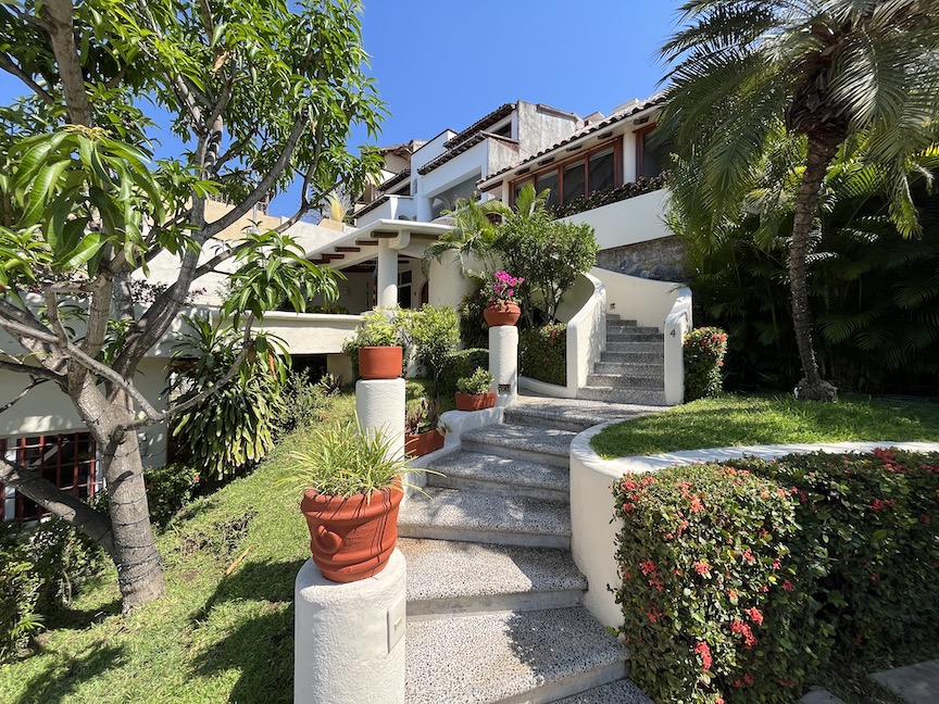
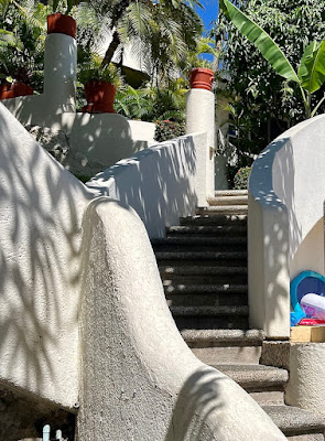
The word “organic” gets used to death, but that’s exactly what this architecture is.  It’s the comfortable, human scale of the place, the way the villas, each with its own unique layout, stair-step up the steep side of the cerro. Connected by winding stairways and sculpted half-walls, each space flows gracefully into the next.   

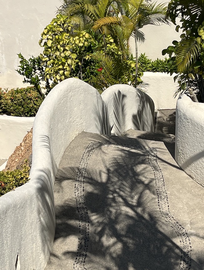
And the details. Everything’s built in as if part of a single work of sculptured stone—counters, sofas, planters, even beds. And nearly everything is curved. I mean it’s really hard to find a sharp, right-angle corner or edge in this whole place. Even stair edges are beautifully rounded off.

 
          The place...is so graceful, yet grounded,
          so comfortable to both the eye and spirit.


A COOPERATIVE EFFORT
Owner Valle describes this style as a blend, but it's primarily what’s known as Santa Fe style. Starting with what was originally a very old house, Valle, working with acclaimed architect Carlos Desormeaux, created VSS’s first two villas, with the first guests arriving in 1993. 

Several other architects, including Hector Palacios, Javier Renteria and Jose Luis Rodriguez have contributed over the years to the gradual addition of ten more units. (And more, including more amenities, are in the works.)

But Valle is quick to point out that the design process has been truly a cooperative effort, one fueled by his own aesthetic as well as contributions from his wife, Marissa, and key staff members.

There are many qualities that make Villas San Sebastian so appealing: its location, its management and employees, the thoughtful, unobtrusive service. I would keep coming back for those assets alone.

But what really sets the place apart for me is the esthetics. So graceful, yet grounded, so comfortable to both the eye and spirit. (And such a good workout climbing down and up some 90 steps to our villa number nine—near the top of the stack—at least once each day.)  

There are certainly trendier, more luxurious places to stay in Zihuatanejo. But, from our first booking at Villas San Sebastian in 2008, this warm, luscious, highly traditional architecture has captivated us.

Friday, August 28, 2020

CREATIVE GENUS – My Career Path From Crayons to Kerning

My fourth-grade teacher, Miss Berg, taught me that I was an artist.

Okay, sure, teachers—at least the good ones—do that all the time; every kid should feel special. But with Miss Berg it was different. When I produced one of my little masterpieces—usually rather dense compositions of geometric shapes and patterns using those luscious, off-color crayons like blue-green, mahogany and Indian red—she would not just encourage me, she’d point to my work as an example for other kids whose design muse evidently wasn’t speaking to them.


I guess that’s all it takes to plant the seeds of a human being’s self-actualization. Sure enough, even though I’d done nothing consciously to hone that dull blade of creativity, by the time I got to college, it just seemed obvious that I’d major in Art. (For some odd reason, my boys military high school had offered no art program. The powers that be must have considered art unmanly—so we had mandatory football instead. Seriously.)

PHYSICS, SCHMYSICS
As college graduation—and the Vietnam War—loomed, I had to figure out a way to continue my education and thus earn a deferment from the draft. It had to be a field that would not only put to use my nascent artistic talents, but lead to an honorable, paying career. So I headed to architecture school.

The creative aspects of architecture tapped into that designer mentality first encouraged by Miss Berg. It seemed a perfectly logical branching out from just two-dimensional shape and crayon-rendered color to three dimensions. Turns out I was pretty good at visualizing space, stacking it, dividing it and making those divisions flow one to the next.


I also loved the creative process: analyzing the requirements of a project, sketching concepts, giving and getting feedback from classmates and faculty “crits,” drafting, modeling… I even enjoyed the bleary-eyed rigor of all-nighters spent in the studio, exchanging ideas and encouragement with my fellow designers.

Unfortunately, along with the third dimension, architecture demanded that I not only design buildings, but make sure they’d stand up when built. And for that, the barely-passing physics and calculus grades I’d eked out in college proved lacking. So I had to take both courses all over again and be ready to apply that knowledge to the second-year architecture class that came closest to engineering: Building Technology.


Building Technology confirmed my love of designing habitable spaces, but sort of backwards. It raised the question that would, in the end, drive me out of architecture as a career: Why the hell can’t I simply design beautiful structures and let someone else— namely an engineer— make sure they won’t collapse under their own weight?

GOODBYE, THIRD DIMENSION  
One of our class projects—this being the height of the early-70s social awareness movement—was setting up a community design center in the heart of St. Paul’s historically-Black Selby-Dale neighborhood. Though, obviously, the focus of our little shop was supposed to be architectural services and advice, a few of our clients brought graphic design challenges along with their architecture ones.

I found myself drawn to those projects: logos, letterheads, brochures, signage. I enjoyed the work and met with some success.

Examples of 70's-style graphic design


It was at this time—struggling through the third year of my five-year bachelor-of-architecture program—that I noticed a job posting on the school’s bulletin board. The Metropolitan Transit Commission (MTC) was looking for a graphic designer. I was ready for a course adjustment, and the required skills seemed to match my abilities. So I interviewed, was hired and quit architecture school.

I was thrilled to have a real job, getting paid quite well to do something I enjoyed—and no physics required. I designed bus schedules, signage, a comprehensive map of the Twin Cities transit system, and even some advertising materials. As I’d hoped, I was able to apply much of what I’d learned in architecture school about the design process to my work with graphics.

(Much later, when asked by a prospective client how I got from architecture school to graphic design, I explained I’d simply abandoned the third dimension.)

      
THE NEW ENGLAND YEARS
Once that door was open to a career in graphic design, I ventured through it and never looked back. The MTC job— and marriage— led to a move to New England, and other opportunities: as an art teacher, as an ad rep and layout artist for a Vermont newspaper, as a designer with an ad agency in New Hampshire, and then as a free lancer.


The free lance thing really appealed to me. This despite the constant pressure of meeting client expectations and wondering where my next gig would come from. And it led to my including copy writing among my services. (Clients were paying me a lot of money to design beautiful layouts, but the copy they were handing me was quite poor—embarrassing really. I knew I could do better.)

With a young family to support, I was barely scratching out a living. And, as beautiful as those Southern Vermont environs were, my spirit just felt out of sync with them. So, when an opportunity came up to work for a top-notch New-York-based fundraising consulting firm—in their Minnesota office, no less—I jumped at the chance, and we moved to Minneapolis.

FIRST SHINGLE
For an interim job it turned out to be by far my most challenging and rewarding work to date. Armed with my still-evolving copy-writing skills and some good instincts for this type of work, I designed, wrote and produced high-end print materials to support multi-million-dollar capital and endowment fundraising campaigns—for the likes of the Cleveland Zoo, the Kansas City Philharmonic, the Indianapolis Museum of Art and the New York City Ballet company.

With that experience—and with those glitzy pieces done for impressive clients in my portfolio—I was able to return to free-lance work, continuing with the emphasis on fundraising.

I hung out my first shingle in 1980. At first, Willius Marketing Communications shared office/studio space in downtown Minneapolis with a small advertising agency. For the next 30 years, now in my own office/studio space, I proceeded to build a respectable client list of my own, comprising businesses, most of the private schools in the Twin Cities Metro (and a few beyond), several entities at the University of Minnesota, and a wide range of other non-profits.


REWARDS
Though I created many gorgeous brochures and coordinated suites of print materials, my favorite projects involved designing corporate and organizational identities—logos, slogans and the like. That, it seemed to me, was pure design and word-smithing—creativity distilled to its essence.


There was a very fulfilling back story to many of these assignments. In the course of researching a client, the tale they had to tell, and their positioning in their marketplace, I had to look for those characteristics—usually abstract features like character, spirit or some unique personal or historical narrative—which truly set them apart.

Occasionally, one of these efforts would result in the organization’s very first serious consideration of what and who it was. As a result, some developed statements of mission and values for the first time.

I continued on this professional path for the next three decades, earning a solid, though mostly low-profile, reputation in my field. I won some recognition, including awards from the American Institute of Graphic Arts, the Center for the Advancement and Support of Education and a couple of paper manufacturers, and inclusion in two “best of” design compendiums.

The greatest rewards of my career, though, were the long-lasting relationships forged with clients—the best kind. And, of course, the work, the deep satisfaction of creating something beautiful and compelling, something that helped people and organizations I believed in to be successful.

                                                      ~  //  ~  //  ~

So, Miss Berg, even though you’ve quite likely passed on to the great classroom in the sky, I want to thank you. You, along with my parents and a few others who could see my potential, set me on a path I’d follow happily for the rest of my life.

You caused me to see myself as you did when I was ten. And how very fortunate that I still do.